
I am Kristina Misko, a teamlead and a product designer at the streaming service with 50 mln MAU. I’ve been browsing in the world of streaming services for about 3 years now, and the longer I am in the sphere, the newer creative patterns on content making, user cases, and streaming formats are being formed. All this, along with my everyday work tasks have made me unite my thoughts about the UX for streaming services into an article to share and discuss with the community.
We are swimming in the sea of content today, so the more fish (= content) is in the sea, the more struggling it is our task, as a user, to choose the film for the night. I myself find it difficult to choose what to watch and keep scrolling my Netflix Main Page wishing my eye fall into something I’d really want to watch. 15 minutes later — still no chosen title, although the catalog astonishes by its content abundance — Roman Holiday, Rebecca, Knives Out, Good Doctor, etc. It just doesn’t fit the mood, so the only option I have is to rewatch my beloved Bridgerton, Money Heist or Murder Mystery.
The example taken from my own user experience is consistently confirmed by various in-house and market ux-research. For instance, one of the reports at Accenture shares the data that ‘more than seven in 10 consumers (72%) reported frustration at finding something to watch’, … ‘with saying it can take them more than 10 minutes to settle on a streaming choice’. As a product designer, I understand the problems, and I see how streaming services do try to solve them. As a user, I keep browsing the catalogue for something new and end up choosing the safe option — coming back to rewatch Shrek.
So, this article is my reflection of the problems a streaming service user may face, and the examples of techniques I as a product designer have tried to solve.
Content Discovery is not just the Search
Let’s continue with the sea-metaphor for large content basis, so on one hand having a golden library (Warner’s Brothers, Paramount, Disney) is a 100% sure-way to attract users to a subscription and preserve retention metrics, yet on the other hand, it is not enough to show off the catalogue and leave a user with it. It needs a blink to catch a goldfish. In other words you are to highlight the titles you want to sell to the user, for example, with short badges about exclusivity, awards, mood and cast. The recent update of Netflix shows that they test such badges about Oscar / Emmy Award or Quotes from significant new settlers.
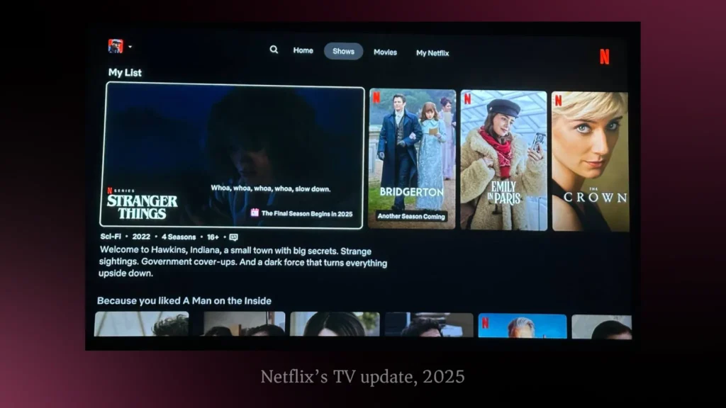
I consider it a smart choice because the quotes are working rather attracting at the bookshelf while you’re choosing a book to buy.
Our service has come to the badge system a bit differently. We’ve done research to understand what users need to quickly choose the title to watch, and genres are no longer the top priority. The mood and keynote (= a prevailing tone or central theme) is taking the first place, leaving the second to genres. So, to help the user find a personal goldfish for the night, we implemented keynotes alongside with genre and TV-Series & Film tags at the Main Mobile Page and Content Cards at all platforms.
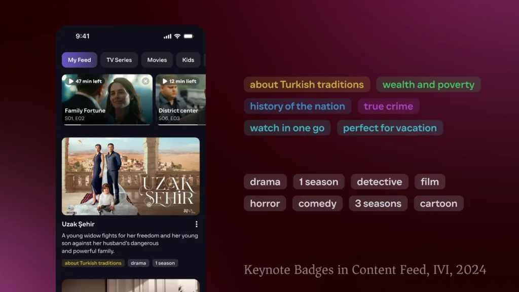
This shift to new aspects of choice shows that even with a golden library, retention depends less on the size of the catalogue and more on the signals that guide each user toward a personal choice. Keynote badges are the way to catch user’s attention on a title, especially an unfamiliar one, because a badge may contain a factor that matches their mood or intention — something the poster alone wouldn’t achieve.
Retention over transactions
Streamings, unlike e-commerce, rely on retention metrics, and UX should maintain interest in watching content daily. With the pattern to get a quicker dopamine through watching reels and shorts, films and TV-series with an-hour-last episodes lose the competition. And the questions on the table are how not to defeat and keep up DAU, WAU, MAU and uprise the active days per user. As a product designer and quite a dedicated watcher myself, I strongly believe in segment theory. To be honest, I don’t even think there is such a theory, so I’d better claim a patent on it. Segment Theory is based on a simple observation of our audience and their habits — since the content catalogue is rather diverse, there are several content groups which form watching conversion and habits which we as a streaming service may change.
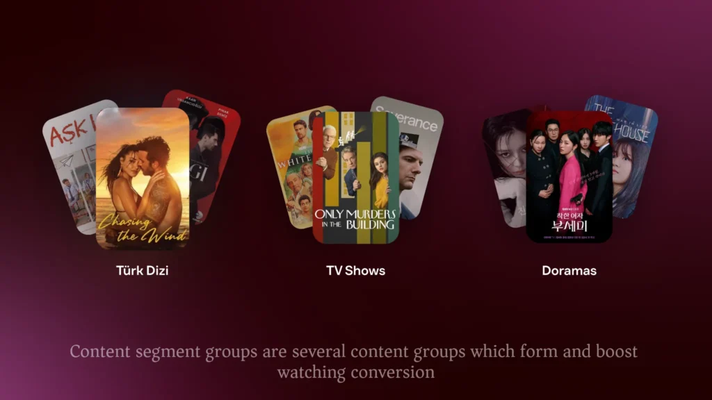
For example, there is a segment of non-comedy series with one releasing episode per week. They dedicate themselves to the shows, yet they are ready to watch several series of the genre simultaneously, which we see as their habit at our streaming. To increase users’ total watch time we started recommending a similar series while they wait for the next episode to be released, and we began reminding them when they had an unfinished episode, or a new one available, in another series that doesn’t require waiting.
Another example of the theory is our segment of Türk Dizi. Users who watch Turkish dramas are our most engaged segment, with distinct content-consumption patterns. They often rewatch episodes while waiting for new ones and are willing to watch in any dubbing just to get early access. To support this behavior, we introduced same-day releases with simultaneous translation, and later send notifications once the full dubbing is available so they can rewatch the episode.
Each of the group has its own UX habits and some of them are being formed with release dates of the titles and promo campaigns, while some content segments’ popularity may be influenced by political and economic agenda.
As a result, we did managed to raise the metric of active days per user by making content segments and understanding the watching behavior inside each of the group. We are in a constant search to improve their watching experience as well. For me as a product designer, the challenge is clear: only by decoding and designing for these varied segment habits can we transform occasional watching into lasting retention and ultimately extend users’ lifetime on the service.
Cross-platform complexity
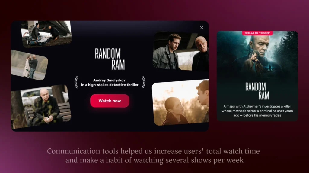
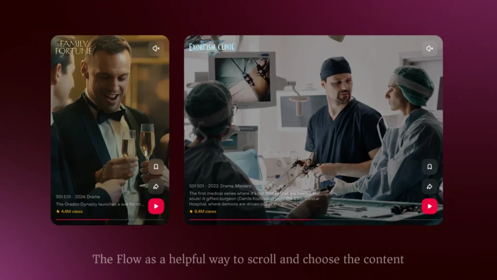
Another core pattern of a streaming user lies in using several platforms, mobile or web on our way to the office and lunch and TV after a hard day to relax. With streaming services having the power to unite the whole user’s life in one app, we as product team are always in a search for new tools and activities to let the user forget about other apps. For example, Netflix launched Games a few years ago, and probably one of the factors to do so was the high percent of audience who played games while watching a film, so it is a good trick to let play games of the same producer as the content you watch. To sound more professional, I share the example from my practice. We have researched the pattern that people prefer to choose what to watch at night on their way home. Also, we noticed that people struggled in having a source for such search — some people watched reels, but had problems with not catching the mood the title they seemed interested in, some people chose the content from their friends had recommended. To circle the search inside our streaming and let users quickly make the choice, we came up with a feature based on short moments from films and TV-series called The Flow.
Alongside with it, we have built a habit of using several platforms at different time per day, so cross-platform complexity turned into a strong advantage of us till today as we see that our users prefer using our mobile app to choose what to watch later the same day, and come back to the service to watch using a more comfortable device. Ultimately, cross-platform complexity isn’t a hurdle to overcome, but an opportunity to guide users seamlessly from quick decisions on mobile to immersive experiences on the big screen.
Business + UX interconnection
All my segment theories and watching habit assumptions are easily to break into an argument about business value of all the UX improvements. The thesis here is any UX change can influence business metrics drastically, although there are always UX experiments that remain either cut out or prove themselves not efficient in a particular streaming. One of my favorite examples for the statement is filters for a better search and solving the user’s problem ‘I don’t know what to watch’. Adding the filters for adapting our Main Page at the mobile app has increased conversion to watch and led to the uprise of active days per user.
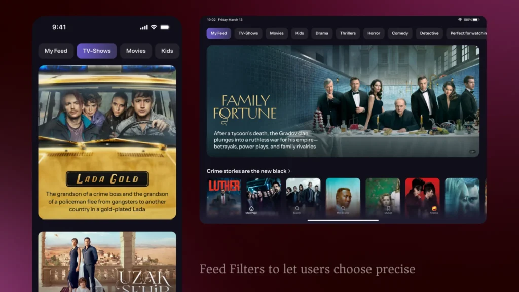
Such a simple feature had been implemented at YouTube for a while and allowed us to gain much more than we initially thought of it. Yet the opposite example needs to prove the statement that successful UX decisions at one streaming may turn into unsuccessful at the other one. Some streamings divide the info card with all the description, facts and actors and the content card itself with a straight transition into watching. So, we went into experimenting whether it would be a good idea for our streaming to separate these two cards on WEB platform where the main aim is to gain new subscribers from SEO. And it turned out to be a rather unsuccessful test for us where we had seen the decrease of watching conversion, low transitions between these two items and high bounce. This only confirms that every UX decision is inseparable from its business context: what drives growth in one streaming can just as easily sink metrics in another.
My years in streaming design have taught me one simple truth: not every recipe is universal. What works for one platform or even streaming may fail for another, and every new feature is both a design decision and a business bet.
When we speak about streaming UX, we are not just navigating an endless sea of titles — we are building the patterns, signals, and experience that help every viewer find their own goldfish. And that is exactly what makes this journey so complex, yet so rewarding for designers and users alike.