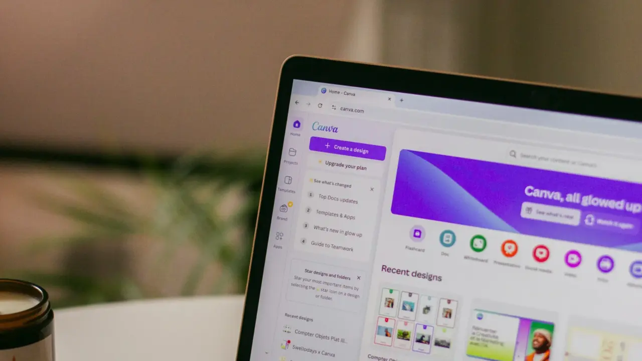
Google is finally giving Chrome users a more practical way to manage tab overload, adding support for vertical tabs on desktop after years of resistance to the idea.
Google announced Tuesday that Chrome users will be able to move tabs to the side of the browser window, where full page titles are easier to read and tab groups are easier to manage.
Users will start seeing an option to organize tabs vertically, a change it described as a “small but significant update” for Chrome on desktop.
Chrome changes course on a long-requested feature
The new option addresses one of Chrome’s most persistent usability complaints: the chaos that comes with keeping too many tabs open at once.
TechCrunch said vertical tabs can be turned on by right-clicking any Chrome window and selecting “Show Tabs Vertically,” while Engadget reported the same control and noted that the feature will begin rolling out starting now.
Once enabled, TechCrunch said, vertical tabs remain the default for that window until the user switches back.
That matters because vertical tabs are especially useful for people who routinely keep large numbers of pages open.
The format is particularly helpful for “power users or researchers” who struggle to find the right tab once titles become too compressed in the traditional horizontal strip.
Engadget went further, saying that before this update, every other major browser but Chrome already offered some form of vertical-tab support, making Google late to a feature that many browser-heavy users now see as essential.
Google pairs the rollout with a new reading mode
Google is not shipping vertical tabs alone.
The company is also launching a refreshed version of Reading Mode, described as a distraction-free, text-focused experience.
The new Reading Mode offers a full-page interface to reduce on-screen clutter and make it easier to focus on text.
Chrome is rolling out an enhanced reading mode and said users can access it by right-clicking a page and selecting “Open in reading mode.”
This combination makes the update feel broader than a simple interface tweak. Vertical tabs help users manage clutter across many pages, while Reading Mode helps clear clutter within a single page. Together, they suggest Google is trying to make Chrome more usable for people who treat the browser as both a workspace and a reading environment.
A response to stronger browser competition
The timing is notable because Chrome has faced growing competition from browsers that market themselves around better organization, cleaner design, or AI-powered workflows.
The vertical-tab rollout shows how “growing competition from modern-day browsers” has influenced Chrome’s development, specifically pointing to Arc and newer AI-focused browsers as examples.
Google had experimented with side tabs years ago but never brought the feature out of beta. This time, however, the company is making it part of the main Chrome experience and said the rollout is happening gradually in all markets.
Chrome has recently been busy shipping other upgrades, including Gemini AI integration, autofill improvements, Split View, and a faster release schedule.
A small feature with a big user payoff
Chrome’s new tab layout is not revolutionary, and Google is far from first.
But for people juggling dozens of tabs every day, it could still be one of the browser’s most useful quality-of-life updates in years.
By finally giving users a better way to read tab titles, organize groups, and clear reading clutter, Google is acknowledging something browsers have tried to solve for a long time: when the web becomes your workplace, the tab bar becomes a productivity problem.