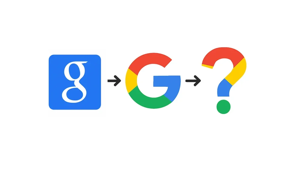
For the first time in 10 years, Google has refreshed its iconic “G” logo, introducing a more modern look that aligns with the company’s evolving design language, according to 9to5Google.
The updated icon ditches the sharp color divisions of red, blue, green, and yellow in favor of a smooth gradient blend — a design style reminiscent of Google’s new AI branding, particularly Gemini.
The revamped logo has already begun appearing in the Google Search app on iOS and in the beta version 16.18 of the Google app for Android. The company is also preparing to roll out the new “G” as its browser icon in the coming weeks.
Notably, Google’s full six-letter wordmark remains unchanged, and there’s no official word yet on whether a broader rebrand is coming. The redesign has sparked online chatter, with some users calling for a full icon overhaul — especially for Google Home, which many say still looks too much like Google Drive.