In markets ruled by entrenched incumbents, one truth holds: you cannot win by playing their games. At Indus Appstore, part of the PhonePe ecosystem and one of India’s largest home-grown app platforms that truth shaped our strategy from the start.
We serve millions of users for whom a smartphone isn’t just a device, but their primary connection to the digital world. In order to earn their trust, we could not simply mimic the existing app store model. We had to reimagine what discovery itself could feel like.
The legacy app store experience was built on a library metaphor: a place you visit, when you already know what you need. Functional, yes – but transactional. Functional, yes – but transactional. Discovery was work: type, scroll, second-guess, repeat. Over time, we realised that this friction wasn’t a minor usability issue; it was the opening we’d been searching for.
This is the story of how moved beyond the tyranny of the search bae, challenged the core premise of app discovery, and built an experience that was effortless, intuitive, and, above all, human.
The Unwinnable Game: Why Incrementalism was a losing strategy
Every challenger begins with data and ours told a sobering story. User behaviour mirrored the dominant app store’s design language. Our analytics showed high bounce rates on the home screen, heavy dependence on the search bar, and limited interaction with curated content.
The search bar often praised as the purest expression of user intent, had quietly become a cage. It could only surface what people already knew existed. It was incapable of revealing the unexpected, the delight of stumbling upon something genuinely new.
We realised that optimising this pattern was futile. Making the search bar 10% smarter or app listing 5% prettier would be like building a faster horse in the age of automobiles to navigate millions of apps with little more than a paddle in an ocean.
So we made a leadership call: stop polishing the odd model. Start from first principles. Ask a better question.
What if discovering an app felt as effortless and delightful as discovering a new song or video?
Engineering a Spark: Our new guiding principle
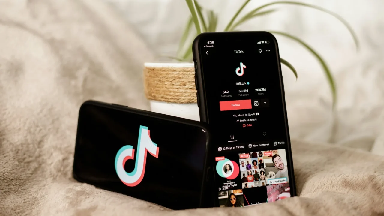
Our inspiration came from outside the app store world entirely. The most magnetic digital experience from TikTok to Instagram Reels – did not rely on lists or grids. They drew users into an immersive flow of content that seemed to anticipate their curiosity. These platforms mastered passive discovery: the art of engaging users without making them search.
That insight became our new guiding principle: Discovery should feel like a spark, not a search.
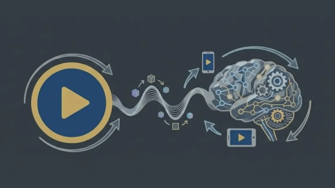
We wanted users to experience that small moment of surprise the instant something new catches their attention and feels personally relevant. Our hypothesis was bold but simple: if short-form video could revolutionise how we consume entertainment could also reimagine how we discover apps?
We decided to test this with 15-second video snippets showcasing apps – short, authentic and scrollable. It was not a cosmetic change; it was a strategic bet on engagemnt as our new competitive moat.
From hypothesis to reality: A phrased approach to innovation
Transforming a core user journey carries risk, especially in a platform environment. We needed to move fast, but with discipline. Our approach was deliberately phased – grounded in learning and validation rather than ambition alone.
Phase 1: The minimum viable experiment
Big ideas don’t always need big data or complex models to begin. Our first step was intentionally simple.
The setup: We curated 100 short videos by hand, a blend of polished brand previews, authentic user gameplay and lightweight app walkthroughs.
The experience: We built a minimalist, vertical-scrolling feed and exposed it to a small user cohort. No recommendation engine. No personalisation. Just a clean, immersive interface.
The question: Was watching a short video a more engaging way to discover an app than reading about it?
The results spoke clearly. Time spent in the app rose noticeably. More importantly, users in the test group initiated significantly more downloads than those browsing traditional lists. It was early validation that the spark we imagined could, in fact, be engineered.
Phase 2: Defining success beyond vanity metrics
“Views” alone were never going to tell the full story. Engagements for engagement’s sake was not our goal – meaningful discovery was. So we built our own measure of success: the Spark Score.
Rather than a single metric, it was a composite of high-intent signals.
- Watch duration: Did users stay beyond 3 seconds> Beyond 10?
- Engagement: Did they rewatch, like, or share?
- Install intent: Did they tap Install after viewing?
By codifying what a “moment of magic” looked like a data form, we gave every tea, member – designers, engineers, marketers, shared North Star. Our mission was not to “increase engagement.” It was to maximise the Spark Score to cultivate moments.
Phase 3: Building complexity through pragmatic design
After authenticity verification, it was tempting to jump straight to personalisation to unlock the potential of AI. But experience taught us that deploying complex technology too early often solves the wrong problem.
Instead, we developed what we called a “hotspot” algorithm: simple, fast, and incredibly effective.
We imagined our video catalog as a long, moving train. The algorithm constantly scanned for “hotspots” – points on the train where user engagement and Spark metrics peaked. New videos were intelligently placed near these hotspots, rather than at the end of the queue.
The result was twofold:
- Each new content had a real chance of finding its audience, avoiding the “chronological trap.”
- The system was lightweight enough to quickly iterate and generate valuable behavioural data.
- Only after we had accumulated sufficient data, millions of user interactions did we implement true AI-powered personalisation. We’ve earned the right to be complex.
Payoff: Measuring changes in user behaviour
When we finally rolled out app discovery through video at scale, the impact was immediate and undeniable.
- From search to luck: Reliance on the search bar decreased by 40%. Users no longer searched, but explored.
- Higher engagement and retention: Users who engaged with the video feed demonstrated twice the retention rate on day seven.
- Business results: The overall install conversion rate (the percentage of visitors who installed at least one app) increased by 15%.
We changed the behavior of millions of users. App discovery turned from a compulsion to something they wanted to do. We replaced resistance with flow, intention with curiosity, and work with pleasure.
Three principles for product leaders challenging the status quo
This journey has cemented several principles that we now apply to every product decision, lessons that extend far beyond app stores.
- Reframe the problem, don’t just optimise the solution. The most significant breakthroughs come not from incremental improvements, but from rethinking the very premise. We didn’t create a better catalog, we reimagined the search process. Once we reframed the problem, innovation followed naturally.
- Start with pragmatism; earn the right to personalise. Complexity is not a virtue, but time is. Our simple “hotspot” model delivered the most value with the least effort. It bought us time, data, and confidence. Start small, learn quickly, and let the evidence give you the right to create complex solutions.
- Transform your “magic moment” into a measurable guiding light . Abstract goals like “increase engagement” rarely inspire clarity. Defining and quantifying our “spark” transformed the idea into an operational compass. This gave every team member a common language for understanding what success is, and why it matters.
At the core of product leadership is empathy, embodied in design and solutions. Sometimes this means building complex systems behind the scenes; sometimes it means creating a simple, delightful interaction that lasts 15 seconds.
Technology evolves, competition intensifies, and user expectations continue to rise. But one thing remains constant: our job is to make discovery simple and easy – to create products that not only work, but resonate. Products that remind users that even in a world ruled by algorithms, the best experiences still feel unmistakably human.