Before computers felt personal, they often felt technical, distant, and intimidating. Screens were filled with text commands, and using a machine usually meant knowing what to type before the computer could respond. Susan Kare helped change that experience by giving early personal computing a visual language that ordinary users could understand.
The Computer History Museum describes Kare as the designer “who gave the Macintosh a smile,” a phrase that captures both her famous Happy Mac icon and her larger contribution to making computers feel less cold.
Kare joined Apple in 1982, she became the “sole creator of screen graphics” in the Macintosh group, developing icons, typefaces, and pixel elements that shaped the original Mac’s look and feel.
Her work mattered because the Macintosh was not only a machine. It was an interface experiment. Apple wanted people to point, click, drag, open, close, save, delete, and print without memorizing command lines. Kare’s job was to turn those abstract actions into pictures.
Icons as a bridge between people and machines
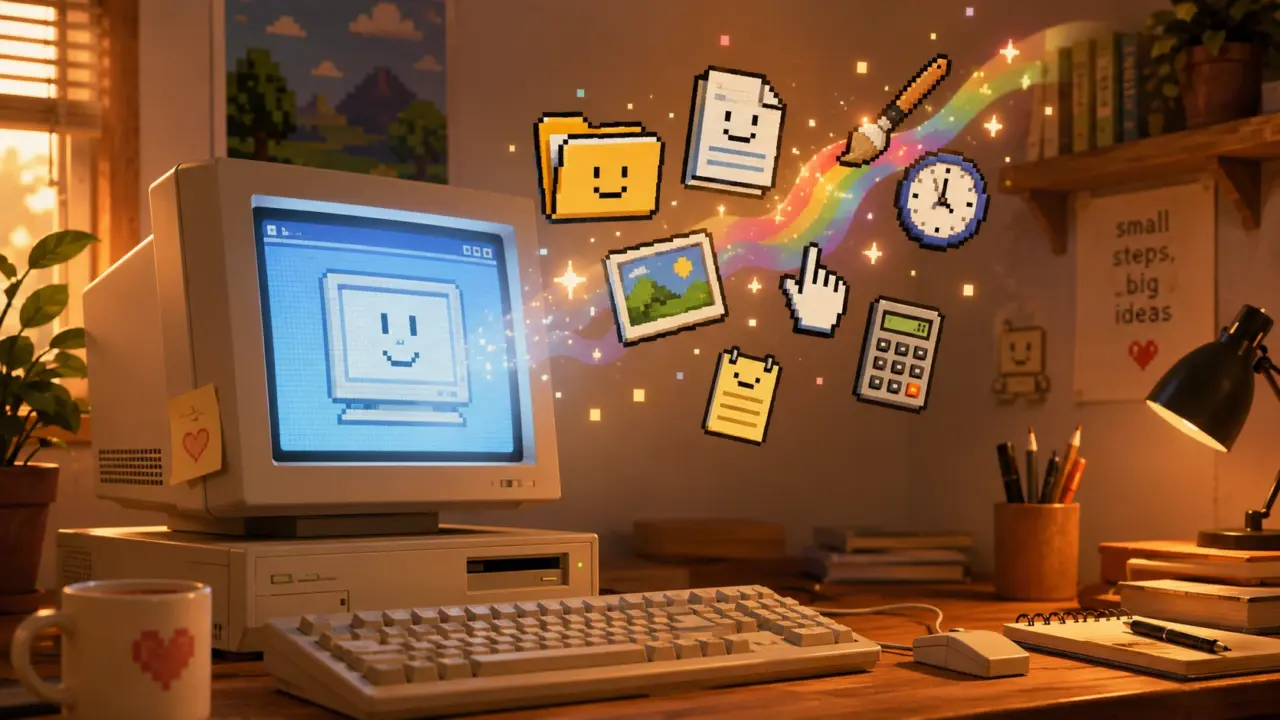
The power of Kare’s icons came from translation. A trash can meant deleting files. Scissors meant cutting. A disk meant saving. A smiling computer meant the machine was ready. These were not decorative drawings; they were operating instructions in visual form.
The Museum of Modern Art says Kare’s Macintosh System 1 icons changed “the communication interface between humans and machines” by making it “easier and friendlier in tone.”
MoMA also explains that Kare designed her Macintosh icons with pencil and pen on graph paper, with each square representing a single pixel, a process that turned analog sketching into digital bitmap design.
This technical constraint is part of what made her work remarkable. Early Macintosh icons had to communicate meaning with very few pixels. There was no room for detail, shading, or realism in the modern sense. Every dot had to matter.
Why simple icons help users think less
Human-computer interaction research helps explain why Kare’s designs worked. Icons can reduce the cognitive load of using software because they let users recognize an action instead of recalling a command from memory.
The Nielsen Norman Group explains that icons must first communicate meaning in a graphical user interface, because unclear icons become confusing visual noise that can stop users from completing tasks.
That principle fits Kare’s design philosophy. Her icons did not simply look charming. They made the computer easier to operate because they connected digital actions to familiar physical objects.
A research paper on icon identification found that icon characteristics strongly affected speed and accuracy, accounting for up to 69% of the variance in user performance during an icon identification task.
The same icon identification study found that semantic distance matters early in learning, while familiarity becomes more important later as users build long-term memory for icons.
That explains why the best icons often feel obvious only after someone has used them enough times. A trash can for deletion may now seem natural, but it became natural because the visual metaphor was repeated, learned, and standardized across interfaces.
The science of visual familiarity
Kare’s strongest icons survived because they balanced novelty and familiarity. They were small enough for a primitive screen but clear enough to become habits.
A study called “An Investigation of Computer Icon Design” found that user performance was best for concrete icons, while abstract icons were identified more slowly and less accurately.
The same computer icon design study explains that icon concreteness refers to how directly an icon represents a real-world object, concept, or action.
Kare’s icons often leaned into concreteness. A pair of scissors was not an abstract symbol for “perform text operation.” It was a familiar tool. The trash can was not a technical file-removal command. It was a place where unwanted things go.
This is why her work felt human. It borrowed from the physical world to make the digital world less strange.
Design under severe limits
Today’s designers work with high-resolution screens, color gradients, animation, and responsive layouts. Kare worked within a tiny black-and-white grid. That limitation demanded discipline.
Smithsonian Magazine reported that Kare connected her early icon work to needlepoint, knitting patterns, and mosaics, because small black-and-white grids reminded her of craft traditions.
That background helped her think in blocks, patterns, and repetition. Her icons had to be readable at a glance, even when reduced to a tiny bitmap. The result was a kind of digital folk art: practical, memorable, and warm.
Cooper Hewitt describes Kare’s early work as developed on a minimalist pixel grid with mosaic-like precision, noting that the icons communicated their functions clearly despite low resolution.
When Cooper Hewitt asked Kare to name three adjectives for good design, her answer was “Meaningful,” “Memorable,” and “Clear”.
Those three words explain why her Macintosh icons still matter. The design was not about making computers pretty. It was about making them understandable.
The Macintosh became more approachable
Kare’s work helped separate the Macintosh from earlier computing experiences. Instead of expecting users to type commands, the Mac invited them to interact with objects on screen.
Smithsonian Magazine says Kare designed pictorial symbols that helped non-technical users operate a computer, a sharp contrast to screens with command-line interfaces.
This shift was important for personal computing. A visual interface made the computer feel less like a machine for specialists and more like a workspace for ordinary people. The desktop metaphor, windows, icons, and menus made digital actions feel closer to real-life actions.
The Interaction Design Foundation explains that screen design depends on visual representation, or the principles by which markings on a surface are made and interpreted.
Kare’s icons worked because they respected those principles. They used marks on a small screen to represent actions, tools, warnings, documents, and emotions.
Her influence moved beyond Apple
Kare’s influence did not stop with the original Macintosh. The visual language she helped establish became part of modern computing culture. Icons became expected. Users learned that software should show options visually, not hide everything behind typed commands.
The Computer History Museum notes that Kare later founded Susan Kare Design and served clients including Microsoft, IBM, and Facebook.
MoMA and SFMOMA also treated her early Macintosh work as design history. A conservation paper on Susan Kare and her Macintosh icons says the museums examined her hand-drawn graphics, sketchbook, and more than 300 floppy disks as part of a co-acquisition.
That museum attention matters. It shows that software icons are not only technical artifacts. They are cultural objects. They reveal how people learned to trust screens, understand machines, and treat computers as everyday companions.
Why Kare’s icons still feel human
Susan Kare’s genius was not that she made icons cute. It was that she made them useful, emotional, and readable under extreme limits.
Her Macintosh graphics gave users a friendlier first impression. The smiling Mac said the machine was awake. The trash can said deletion could be understood. The scissors and disk connected digital work to ordinary tools. Each icon reduced the distance between human intention and machine action.
That is why her work remains relevant in an age of smartphones, apps, emojis, and AI interfaces. Modern technology still needs symbols that make complex systems feel understandable.
Kare’s icons proved that good software design is not only about code. It is also about empathy. A computer becomes easier to use when it speaks in a visual language people can recognize, remember, and trust.
Her small black-and-white icons helped make the computer feel human because they treated users as humans first.